AdminCP
Customize a Content Engine content type's screens in the VitNode AdminCP, including list columns, search, sorting, form sections, page mode and custom cells, fields and layouts.
Every content type registered in the plugin's src/admin/content.tsx gets an AdminCP list and a create and edit form without any UI code. Most changes are options in the definition's admin block. For anything the options cannot express, you swap one cell, one field or the whole form layout for your own component.
This page uses the example plugin's example.article. Its screen lives at /admin/content/example/articles.
Choose list columns, search and sorting
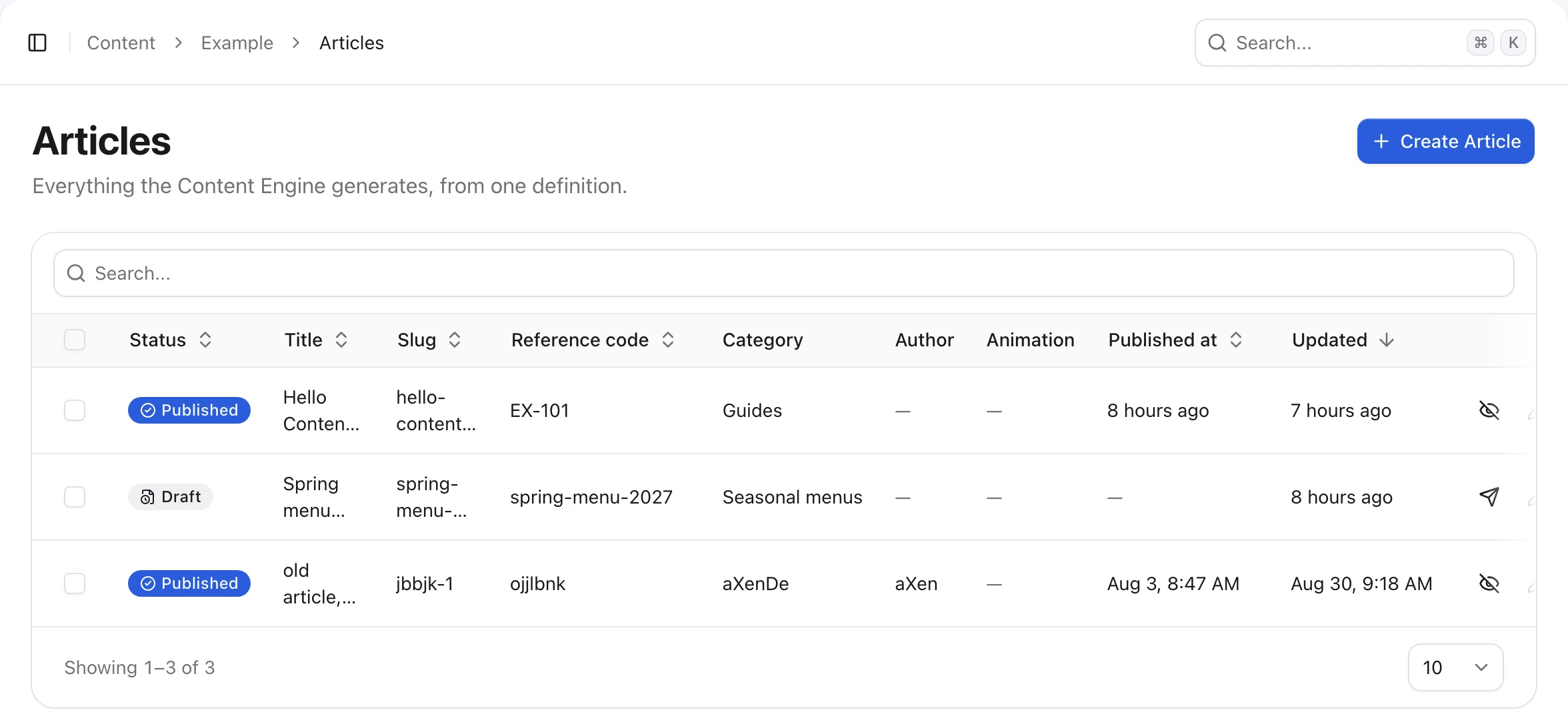
admin.list drives the list:
admin: {
  path: "example/articles",
  titleField: "title",
  list: {
    columns: [
      "status",
      "title",
      "slug",
      "code",
      "category",
      "author",
      "animation",
      "publishedAt",
      "updatedAt",
    ],
    searchableFields: ["title", "code", "excerpt"],
    orderableFields: ["title", "code", "slug"],
    defaultOrderBy: "updatedAt",
    defaultOrder: "desc",
  },
},
| Option | What it does |
|---|---|
columns | Table columns, in order. The default is status (with publication), every shared single-value field, then updatedAt. |
searchableFields | Fields the search box matches: text, textarea, slug or richText. A localized field matches in any language. The default is every shared text and textarea field. When the list ends up empty, the search box is hidden. |
orderableFields | Your own fields with a sortable header. id, createdAt and updatedAt are always sortable, and so are status, publishedAt (with publication) and version (with editorial), so leave them out. Localized and file fields cannot be sorted. |
defaultOrderBy | Initial sort column. Must be a built-in column or one of orderableFields. Defaults to updatedAt. |
defaultOrder | "asc" or "desc". Defaults to "desc". |
thumbnailField | A single shared field.file() drawn at the start of the title cell. titleField must be one of the columns. |
A to-many field.user() or field.relation() can be a column. People show with their role color and relations as badges, loaded once per page instead of once per row. A gallery (field.file({ multiple: true })), a group or a repeatable cannot. A file column shows a thumbnail and the file name, which is why animation above is a column but not sortable.
Every mistake here, such as an unknown field or a gallery in columns, throws a ContentEngineError when the plugin loads, so you find it before an editor does.
Other admin options
| Option | Default | What it does |
|---|---|---|
path | The id with dots as slashes | URL under /admin/content/. Lowercase segments of letters, digits and dashes; cannot end in create or edit. |
titleField | First shared text or textarea field | Names a record in toasts, dialogs and relation pickers. null means the type has no title. |
colorField | none | A shared field with a color, shown as a swatch next to the title. The blog's categories use it. |
navigation | true | Set it to false to keep the screen but drop its sidebar link. |
permissionModule | The id without the plugin part | Staff permission module name, for example article for example.article. |
Bulk actions
Ticking rows opens a floating bar with Publish, Unpublish and Delete. There is nothing to configure. Publish and Unpublish appear with publication and the can_publish permission, Delete with can_delete. Without any of them, the table has no checkboxes.
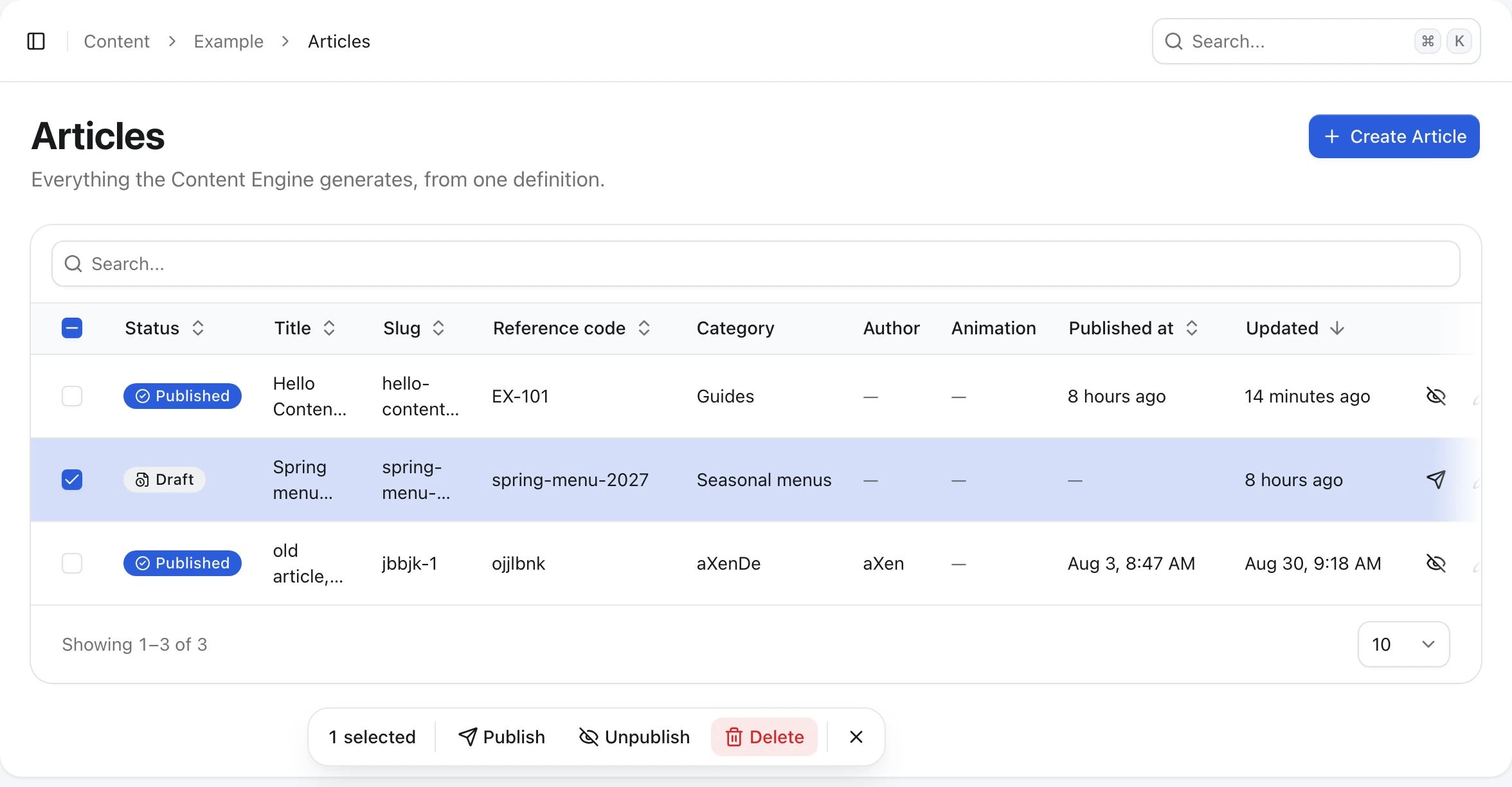
Each action asks for confirmation and then sends one request per record to the same route the row buttons use, so events, search indexing and revisions behave as if you clicked every row. When some records fail, for example because someone else saved them meanwhile, the rest still go through. A toast says how many were skipped, and those rows stay ticked.
Group form fields into sections
By default the form shows every field except field.blocks(), one after another, in a dialog:
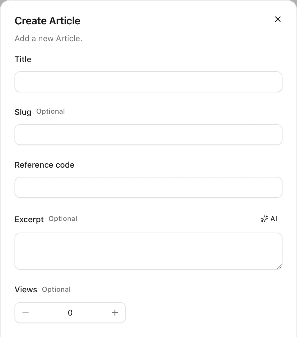
To pick and order fields, set admin.form.fields. To group them into titled cards, use admin.form.sections instead:
admin: {
  form: {
    sections: [
      { name: "main", fields: ["title", "slug", "excerpt", "category"] },
      { name: "media", fields: ["animation", "gallery"] },
      { name: "settings", fields: ["code", "author", "featured", "noIndex", "views"] },
    ],
  },
},- Sections are the field list, so a field you leave out is not in the form. Declaring both
fieldsandsectionsthrows. - Each field belongs to one section, and no section may be empty.
- A section
nameis lowercase snake case, because it is part of a translation key.
The heading and an optional description come from the plugin's locale file, at content.<entity>.form.<name>. Without a message, the heading is the humanized name ("Main").
{
  "@vitnode/example": {
    "content": {
      "article": {
        "form": {
          "main": { "title": "Article", "desc": "What readers see first." },
          "media": { "title": "Media" }
        }
      }
    }
  }
}
Open forms on their own page
Forms open in a dialog. A long form reads better on a page, which is what the blog does for its articles:
admin: {
  path: "blog/articles",
  create: { mode: "page" },
  edit: { mode: "page" },
},
The create form moves to /admin/content/blog/articles/create and the edit form to /admin/content/blog/articles/{id}/edit. You can set the two modes independently.
Replace a field or a cell
Wrap a registration in contentTypeAdmin to swap the component of one form field or one list column. It adds nothing at runtime; it only checks that the keys are real field names. The blog plugin does this for its category color:
import type { ContentFrontendPluginSource } from "@vitnode/core/lib/plugin";

import { contentTypeAdmin } from "@vitnode/core/lib/plugin";

import { CONFIG_PLUGIN } from "@/const";
import { BlogCategoryColorCell } from "@/views/admin/category/color-cell";
import { BlogCategoryColorField } from "@/views/admin/category/color-field";

import { blogCategoryNav } from "./nav";

export const adminContent = {
  pluginId: CONFIG_PLUGIN.pluginId,
  contentTypes: [
    contentTypeAdmin({
      ...blogCategoryNav,
      fields: {
        color: { component: BlogCategoryColorField },
      },
      columns: {
        color: { cell: BlogCategoryColorCell },
      },
    }),
  ],
} satisfies ContentFrontendPluginSource;
A cell receives the row, typed by the definition:
import type { ContentCellProps } from "@vitnode/core/lib/plugin";

import { useTranslations } from "use-intl";

import type { blogCategoryContentType } from "@/content/category";

export const BlogCategoryColorCell = ({
  row,
}: ContentCellProps<typeof blogCategoryContentType>) => {
  const t = useTranslations("@vitnode/blog.admin.category");

  if (!row.color) {
    return <span className="text-muted-foreground">{t("color.none")}</span>;
  }

  return (
    <div className="flex items-center gap-2">
      <span
        aria-hidden
        className="size-4 shrink-0 rounded-full border"
        style={{ backgroundColor: row.color }}
      />
      <span className="text-muted-foreground truncate text-sm">
        {row.color}
      </span>
    </div>
  );
};
A field component receives ItemAutoFormComponentProps from @vitnode/core/components/form/auto-form and usually wraps an AutoForm field with your own label or control.
Add skeleton when the component is bigger than its field kind suggests, so the loading placeholder matches. The blog's content field renders a rich editor and sets skeleton: "editor". The options are "editor", "input", "list", "media", "switch" and "textarea".
Replace the whole form layout
For a layout the options cannot express, such as a main column with a sidebar, pass forms.layout to contentTypeAdmin. A custom layout is used only in page mode, so set create.mode and edit.mode to "page" first.
import type { ContentFormLayoutProps } from "@vitnode/core/lib/plugin";

import {
  ContentFormActions,
  ContentFormField,
  ContentFormHeader,
  ContentFormLayoutGrid,
  ContentFormMain,
  ContentFormRemainingFields,
  ContentFormSection,
  ContentFormSidebar,
  ContentFormStatus,
} from "@vitnode/core/content/admin-form";

const SIDEBAR_FIELDS = ["category", "author", "featured", "noIndex"];

export const ArticleFormLayout = ({ mode }: ContentFormLayoutProps) => (
  <>
    <ContentFormHeader>
      <ContentFormActions />
    </ContentFormHeader>

    <ContentFormLayoutGrid>
      <ContentFormMain>
        <ContentFormSection>
          <ContentFormRemainingFields exclude={SIDEBAR_FIELDS} />
        </ContentFormSection>
      </ContentFormMain>

      <ContentFormSidebar>
        {mode === "edit" ? <ContentFormStatus /> : null}
        {SIDEBAR_FIELDS.map(name => (
          <ContentFormField key={name} name={name} />
        ))}
      </ContentFormSidebar>
    </ContentFormLayoutGrid>
  </>
);contentTypeAdmin({
...exampleArticleNav,
forms: { layout: ArticleFormLayout },
}),forms.create.layout and forms.edit.layout override the shared one per action. ContentFormRemainingFields renders every form field you did not place yourself. In development, the browser console warns about fields the layout never rendered and about a missing ContentFormHeader, which holds the title and the back link.
Show a matching skeleton
A loading screen that looks nothing like the form is the visual version of a
jump scare. The Content Engine avoids it by rendering your layout twice: first in
skeleton mode while the record loads, then for real. In skeleton mode,
useContentForm().skeleton is true and every <ContentFormField name="..." />
draws a placeholder instead of the field.
So a layout built only from ContentFormField, ContentFormRemainingFields and
the other ContentForm* pieces already has a matching skeleton. You only need
two extra steps when your form draws more than fields.
Size a field's placeholder
Each placeholder is sized from the field's kind. When your field component is
bigger than its kind suggests, set skeleton next to component, as described
in Replace a field or a cell:
fields: {
  content: { component: BlogArticleEditorField, skeleton: "editor" },
  excerpt: { component: ArticleExcerptField, skeleton: "textarea" },
},
Draw a skeleton for a custom layout
A layout with its own header, a large title or a cover image should draw a
skeleton with the same wrappers, gaps and widths. Return it while skeleton is
true, and use the same component as the Suspense fallback when the real
editor is lazy-loaded. Then the reload goes skeleton → form with nothing in
between.
import type { ContentFormLayoutProps } from "@vitnode/core/lib/plugin";

import { Skeleton } from "@vitnode/core/components/ui/skeleton";
import { useContentForm } from "@vitnode/core/content/admin-form";
import React from "react";

const loadArticleEditor = async () => await import("./editor/article-editor");

const ArticleEditor = React.lazy(async () =>
  loadArticleEditor().then(module => ({ default: module.ArticleEditor })),
);

const ArticleEditorSkeleton = () => {
  const { fieldNames, markHeaderRendered, markRendered, mode, skeleton } =
    useContentForm();

  markHeaderRendered?.();
  if (!skeleton) for (const name of fieldNames) markRendered?.(name);

  React.useEffect(() => {
    void loadArticleEditor();
  }, []);

  return (
    <div aria-busy="true" className="flex flex-col">
      <div className="flex min-h-14 items-center gap-2 border-b px-4 py-2">
        <Skeleton className="h-8 w-36" />
        <div className="flex-1" />
        <Skeleton className="h-9 w-36" />
      </div>
      <div className="mx-auto flex w-full max-w-3xl flex-col gap-6 px-4 py-8">
        {mode === "edit" ? (
          <Skeleton className="aspect-2/1 w-full rounded-xl" />
        ) : (
          <Skeleton className="h-36 w-full rounded-xl" />
        )}
        <Skeleton className="h-10 w-3/4" />
        <Skeleton className="h-96 w-full rounded-lg" />
      </div>
    </div>
  );
};

export const BlogArticleFormLayout = ({
  contentTypeId,
  itemId,
}: ContentFormLayoutProps) => {
  const { skeleton } = useContentForm();

  if (skeleton) return <ArticleEditorSkeleton />;

  return (
    <React.Suspense fallback={<ArticleEditorSkeleton />}>
      <ArticleEditor contentTypeId={contentTypeId} itemId={itemId} />
    </React.Suspense>
  );
};
A few things that keep it smooth:
- Copy the real wrappers. Same outer
div, same padding, samemax-w-*, same breakpoints. A skeleton that is 20 pixels shorter still makes the page jump. - Branch on
mode. The create form often looks different, for example an empty upload area instead of a cover image and other buttons in the header. - Call
markHeaderRendered()when the skeleton draws its own header, so the development warning about a missingContentFormHeaderstays quiet. - Mark the fields as rendered in the fallback. While the lazy editor loads, the real form is up, so the skeleton tells it that the layout will place every field. Without it, the console warns about missing fields for a moment.
- Start loading the editor from the skeleton. The
useEffectabove fetches the editor's code while the record is still loading, so the fallback is rarely seen at all. - Use
Skeletonfrom@vitnode/core/components/ui/skeletonand the Tailwind spacing scale, so placeholders match the theme in light and dark mode.
Check the result
Save the definition, restart pnpm dev and open AdminCP → Example → Articles. The API validates sorting and form input against the same definition, so the restart makes sure both sides read the new admin options.
Next, give the screens the permissions they need in Production checklist, or read every option in the reference.