Single Sign-On (SSO)
Provider Icons and Colors
Put a brand mark and a brand color on your SSO login buttons - an inline SVG or image URL and a hex color from the adapter, or a React component registered in the browser.
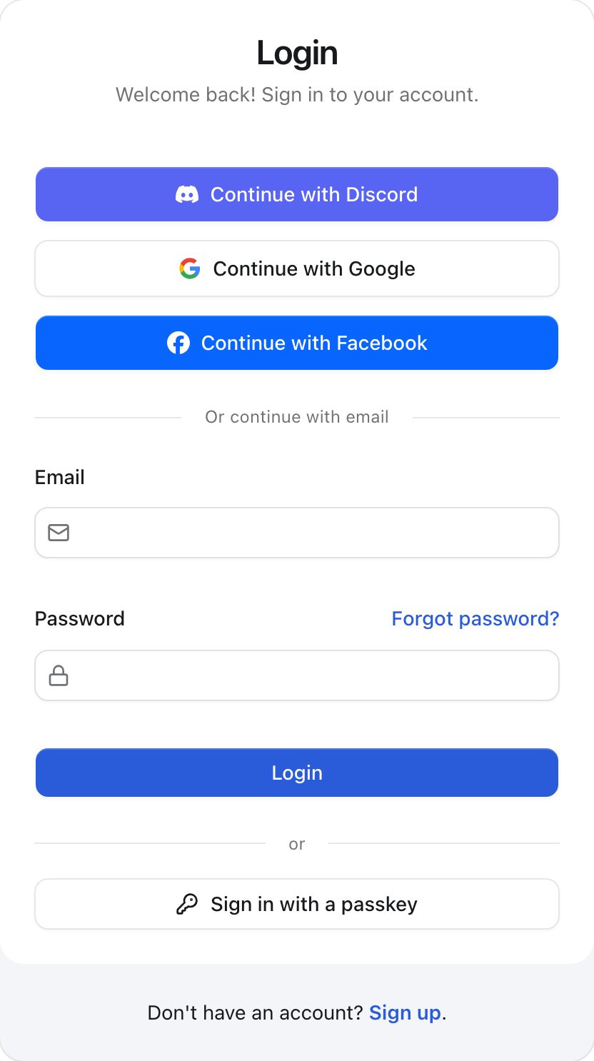
Every SSO provider gets a full-width Continue with Provider button on
/login and /register. The built-in Google, Discord and Facebook adapters
already carry their brand marks and colors, so those buttons look right without
any configuration. A custom adapter starts out as a neutral button with
text only - a GitHub button with no octocat - and this page shows how to
give it a mark and a color.
From the adapter (SVG or image)
Add an icon to whatever your adapter returns. It travels to the browser with
the rest of the provider list, so it has to be a string: inline SVG markup, or a
URL the browser can load as an image.
export const GitHubSSOApiPlugin = (): SSOApiPlugin => ({
  id: 'github',
  name: 'GitHub',
  icon: '<svg viewBox="0 0 24 24" xmlns="http://www.w3.org/2000/svg"><path fill="currentColor" d="M12 .297c-6.63 0-12 5.373-12 12 0 5.303 3.438 9.8 8.205 11.385.6.113.82-.258.82-.577 0-.285-.01-1.04-.015-2.04-3.338.724-4.042-1.61-4.042-1.61C4.422 18.07 3.633 17.7 3.633 17.7c-1.087-.744.084-.729.084-.729 1.205.084 1.838 1.236 1.838 1.236 1.07 1.835 2.809 1.305 3.495.998.108-.776.417-1.305.76-1.605-2.665-.3-5.466-1.332-5.466-5.93 0-1.31.465-2.38 1.235-3.22-.135-.303-.54-1.523.105-3.176 0 0 1.005-.322 3.3 1.23.96-.267 1.98-.399 3-.405 1.02.006 2.04.138 3 .405 2.28-1.552 3.285-1.23 3.285-1.23.645 1.653.24 2.873.12 3.176.765.84 1.23 1.91 1.23 3.22 0 4.61-2.805 5.625-5.475 5.92.42.36.81 1.096.81 2.22 0 1.606-.015 2.896-.015 3.286 0 .315.21.69.825.57C20.565 22.092 24 17.592 24 12.297c0-6.627-5.373-12-12-12" /></svg>',
  // ... getUrl, fetchToken, fetchUser
})
Use fill="currentColor" and leave the width and height off: the mark then
takes the button's text color in both light and dark mode - white on a
brand-colored button - and is sized to match the label. A
multicolor mark, such as Google's four-color G, keeps its own fills; give its
adapter no brand color so it sits on the neutral button it was designed for.
An image works the same way:
icon: 'https://cdn.example.com/brands/slack.svg' // remote file
icon: '/icons/slack.png' // something in your app's public folder
icon: 'data:image/png;base64,iVBORw0KGgo...' // inlined bytesThe markup is inserted into the page, so it is checked before it renders:
- inline markup must be a single
<svg>...</svg>element - an XML prolog, aDOCTYPEand comments around it are fine and get stripped, - nothing executable - no
<script>, noonload-style attributes, nojavascript:URLs, no<foreignObject>, and no<style>block (a<style>inside inline SVG is not scoped, so it would restyle the whole page), - image URLs must be
https:,http:, a root-relative path (/icons/x.png), or adata:image/...URI, - at most 16 KB.
An icon that fails any of those is dropped. The button keeps its name and still signs people in - you lose the mark, never the provider. In development the console says which provider's icon was dropped, so a silent button is never a mystery.
Importing an .svg file
You do not have to paste the markup. Where the adapter is bundled by Vite -
apps/web, or any generated VitNode app - import the file itself:
import githubIcon from './icons/github.svg?raw' // the file's markup
import slackIcon from './icons/slack.svg' // the file's URL

export const vitNodeApiConfig = buildApiConfig({
  authorization: {
    ssoAdapters: [
      GitHubSSOApiPlugin({ icon: githubIcon }),
      SlackSSOApiPlugin({ icon: slackIcon }),
    ],
  },
  // ...
})
Both work: ?raw hands you the file's contents - prolog, DOCTYPE, generator
comment and all - and a plain import hands you a URL (/assets/slack-a1b2c3.svg
after a build, or an inlined data:image/svg+xml,... for a small file). Prefer
?raw when you want the mark to follow the button's text colour, since a file
loaded through <img> cannot see currentColor.
A standalone API app such as apps/api runs on Node with no bundler, so an
import of an .svg is not a module there. Read the file instead:
import { readFileSync } from 'node:fs'

const githubIcon = readFileSync(
  new URL('./github.svg', import.meta.url),
  'utf8',
)
Read it once at module scope, not inside getUrl - and remember tsc does not
copy .svg files into dist, so either copy it as part of your build or keep
the markup in a .ts constant, the way VitNode's own adapters do.
If you would rather have a component than a string, register it in the browser instead - see From the browser.
Brand color
Add a brandColor to fill the button with the provider's color, the way the
built-in Discord (#5865F2) and Facebook (#0866FF) adapters do:
export const GitHubSSOApiPlugin = (): SSOApiPlugin => ({
  id: 'github',
  name: 'GitHub',
  icon: githubIcon,
  brandColor: '#24292F',
  // ... getUrl, fetchToken, fetchUser
})
The value has to be a hex color - #RGB or #RRGGBB. The button picks its
own text color: white when white text reaches a 4.5:1 contrast ratio on your
color, near-black otherwise, so a yellow brand still gets a readable label. A
currentColor icon follows that text color.
Leave brandColor out and the button stays neutral, with a border. That is the
right choice for providers whose guidelines ask for a neutral button, such as
Google and Microsoft. A value that is not a hex color is ignored the same way,
and in development the console names the provider.
From the browser (React component or JSX)
If you would rather ship an icon as a component - a lucide-react icon, a
component from your own design system, or plain JSX - register it by provider
id. A registered icon wins over whatever the adapter sent.
import { configureSSOIcons } from '@vitnode/core/tanstack/auth'

import { GitHubIcon } from './components/icons/github'

configureSSOIcons({
  github: GitHubIcon, // a component: rendered with `className="size-4"`
  slack: <img alt="" className="size-4" src="/icons/slack.png" />, // or JSX
})
Call it from a module your router entry imports, so it has run before the login
screen renders. configureSSOIcons merges, so you can call it more than once -
once per plugin, if that suits you.
This is also the escape hatch for a provider whose mark you cannot express as one static SVG: an animated logo, a theme-aware pair of files, or an icon that needs a wrapper element.
Reference
Prop
Type