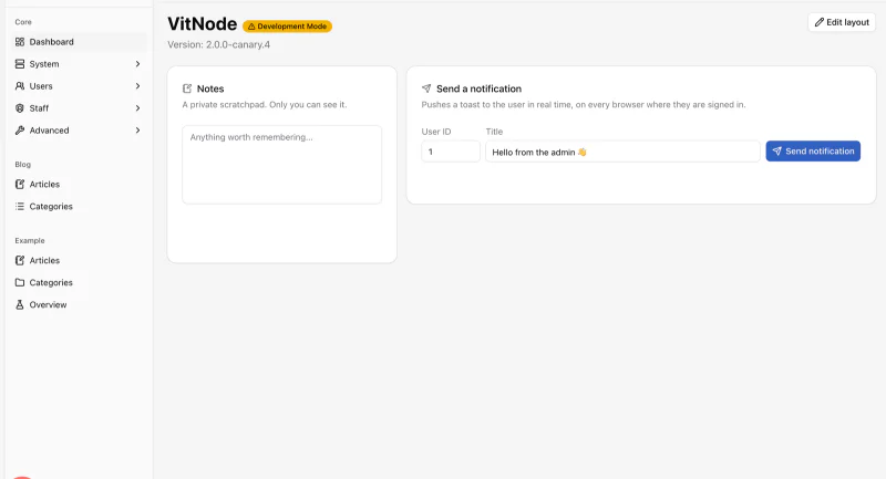
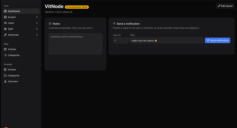
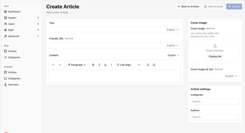
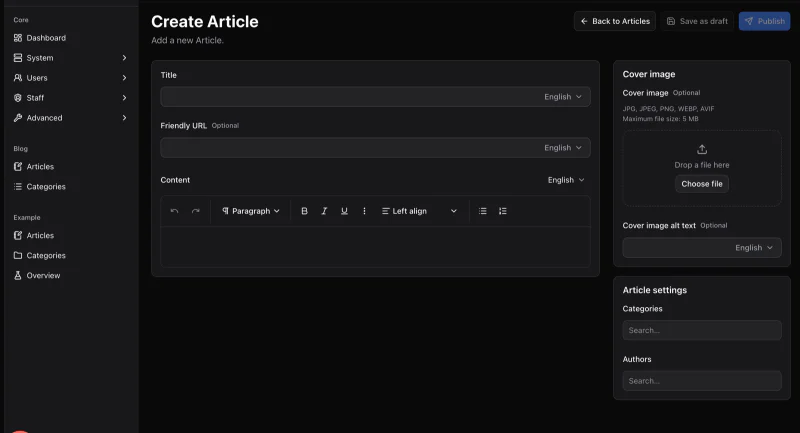
Carousel
A swipeable Embla carousel with arrow buttons, keyboard and RTL support, vertical mode and reduced motion built in.
Preview
Usage
import {
  Carousel,
  CarouselContent,
  CarouselItem,
  CarouselNext,
  CarouselPrevious,
} from '@vitnode/core/components/ui/carousel'<Carousel aria-label="Screenshots">
<CarouselContent>
<CarouselItem>...</CarouselItem>
<CarouselItem>...</CarouselItem>
</CarouselContent>
<CarouselPrevious />
<CarouselNext />
</Carousel>Embla Carousel does the swiping and dragging, so it moves like a native app, not a 2009 slideshow.
The arrows sit just outside the slides, so leave room around the carousel
(px-12). On narrow screens, add static and put them in a row of their own,
like the previews.
Sizes
Items are full width by default. Change it with basis-*, responsive classes
included.
<Carousel opts={{ align: 'start' }}>
  <CarouselContent>
    <CarouselItem className="basis-1/2 sm:basis-1/3">...</CarouselItem>
  </CarouselContent>
</Carousel>
Spacing
The gap is a start padding on CarouselItem (ps-4) and a matching negative
margin on CarouselContent (-ms-4). Change both together. Both are logical,
so RTL gets the gap on the right side.
<CarouselContent className="-ms-2 md:-ms-4">
  <CarouselItem className="ps-2 md:ps-4">...</CarouselItem>
</CarouselContent>
Vertical
orientation="vertical" scrolls up and down. Give CarouselContent a fixed
height and space with -mt-* / pt-*.
<Carousel orientation="vertical" opts={{ align: 'start' }}>
  <CarouselContent className="-mt-2 h-48">
    <CarouselItem className="basis-1/2 pt-2">...</CarouselItem>
  </CarouselContent>
</Carousel>
Options
opts goes straight to Embla: loop for an endless ride, align to snap to
start, center or end, dragFree for free scrolling.
<Carousel opts={{ align: 'start', loop: true }}>...</Carousel>On a right-to-left page, tell Embla too. The layout flips by itself, but the scroll math needs the hint:
<Carousel dir="rtl" opts={{ direction: 'rtl' }}>API
setApi hands you the Embla instance for custom controls, like the dots in the
preview.
import type { CarouselApi } from '@vitnode/core/components/ui/carousel'

const [api, setApi] = React.useState<CarouselApi>()
const [current, setCurrent] = React.useState(0)

React.useEffect(() => {
  if (!api) return

  const onSelect = () => {
    setCurrent(api.selectedScrollSnap())
  }

  api.on('select', onSelect)

  return () => {
    api.off('select', onSelect)
  }
}, [api])

<Carousel setApi={setApi}>...</Carousel>
api.scrollTo(index) is all a dot button needs. Inside the carousel,
useCarousel() returns api, scrollPrev, scrollNext, canScrollPrev and
canScrollNext.
Plugins
Pass Embla plugins through plugins, for example autoplay:
bun i embla-carousel-autoplayimport Autoplay from 'embla-carousel-autoplay'
<Carousel plugins={[Autoplay({ delay: 4000, stopOnInteraction: true })]}>Keep stopOnInteraction on, and skip autoplay under reduced motion. Nobody
likes chasing a runaway slide.
Accessibility
- The root is a
regionwitharia-roledescription="carousel". Give it anaria-label. - Each slide is a
groupwitharia-roledescription="slide". Add a label likearia-label="2 of 5". - The arrows have translated "Previous" / "Next" labels and disable at the ends.
- With focus inside, arrow keys change slides: left/right when horizontal,
up/down when vertical. In RTL (
dir="rtl"oropts.direction), left and right follow the reading direction. - Text fields keep their arrow keys, and so does any child that handled the key.
- Under reduced motion, slides change instantly instead of gliding.
Props
Prop
Type
CarouselPrevious and CarouselNext take every Button prop
and default to variant="outline" and size="icon-sm".