Editor
Rich text editor built on TipTap with a one-row toolbar, slash commands, emoji, panels, task lists, image uploads and file attachments.
Preview
Type / for blocks or : for emoji. Your fingers never leave the keyboard, and your coffee stays safe.
Usage
import { z } from 'zod'
import { AutoForm } from '@vitnode/core/components/form/auto-form'
import { AutoFormEditor } from '@vitnode/core/components/form/fields/editor'

const formSchema = z.object({
  content: z.string().min(1, 'Write something first'),
})<AutoForm
formSchema={formSchema}
fields={[
{
id: 'content',
component: (props) => <AutoFormEditor {...props} label="Announcement" />,
},
]}
/>Toolbar
One row, even in a narrow form. Everyday tools sit up front, the rest in menus:
- Text style: paragraph or heading 1–4.
- Bold, italic and …: underline, strikethrough, inline code, alignment, Clear formatting.
- Text color, lists (bulleted, numbered, task), link, emoji, table, code block.
- + Insert: quote, code block, table, divider, emoji, audio and panels, plus images and files when the editor allows uploads. Images and files from other languages show in a Reuse bar under the toolbar.
Slash commands
Type /, keep typing to filter (/tab finds Table), pick with the
arrow keys and Enter. Search matches translated names and English
keywords, so /table works in every language.
Emoji
Type : and a few letters (:rocket) to get suggestions, or use the
toolbar picker. Add your own emoji for every editor in vitnode.config.ts:
export const vitNodeConfig = buildConfig({
  editor: {
    emojis: [
      {
        label: 'VitNode',
        emojis: [
          { name: 'vitnode', src: '/logo.svg', tags: ['logo', 'brand'] },
        ],
      },
    ],
  },
})
name is the shortcode (:vitnode:), tags are extra search words, and
label heads the section in the picker.
Panels
Threads older than a year are archived automatically.
Check your SMTP settings
Password reset emails will fail until a sender address is set.
Deleting a category removes every thread inside it.
Migration finished
12,480 posts moved without a single error.
Callouts in four kinds: info, warning, error, success. One paragraph is
a muted note. Add a second and the first becomes the title.
Insert one from + Insert or /panel. Picking the same kind again removes
it; another kind switches the color. Panels are saved as plain HTML,
<div class="tiptap-panel" data-panel="info">, so EditorContent renders them
as is.
Task lists
Each item stores its checkbox state, so acceptance criteria stay ticked after
saving. Start one from the toolbar, /task, or type [ ] at the start of a
line.
Keyboard shortcuts
| Action | Shortcut |
|---|---|
| Submit the form | Ctrl/⌘ + Enter |
| Bold / italic | Ctrl/⌘ + B / I |
| Underline | Ctrl/⌘ + U |
| Bulleted list | Ctrl/⌘ + Shift + 8 |
| Numbered list | Ctrl/⌘ + Shift + 7 |
| Task list | Ctrl/⌘ + Shift + 9 |
| Undo / redo | Ctrl/⌘ + Z / Shift + Z |
Ctrl/⌘ + Enter submits the surrounding form, like its submit button. Outside a form it does nothing.
Accessibility
- The toolbar is one tab stop. ← → move between buttons, Home / End jump to the ends.
- In AutoForm, the writing area is named by the label, described by the description and error, and outlined red when invalid.
- The
/and:menus announce the highlighted option, and open upward when there's no room below. - A same-size placeholder holds the spot while the editor loads, so the page doesn't jump.
Click to activate
A form with several editors gets tall fast, and each one loads Tiptap. Add collapsed to show a one-line field instead. Clicking it swaps in the full editor with the cursor at the end, and if the field already holds content, the one-line field previews it as plain text.
<AutoFormEditor
  {...props}
  collapsed
  format="json"
  label="Note for moderators"
  placeholder="Add a note…"
/>
The placeholder shows on the one-line field and inside the editor while it's empty. Once opened, the editor stays open until the form unmounts.
Multi-language
Add multiLang to edit the content in every enabled language. A language select
(shown with two or more languages) switches the language being edited, not the
app locale.
import { multiLangValueSchema } from '@vitnode/core/lib/helpers/multi-lang'

const formSchema = z.object({
  content: multiLangValueSchema({ minLength: 1 }).min(1),
})<AutoFormEditor {...props} label="Content" multiLang />The value becomes { languageCode, value }[], matching core_languages_words:
const value = [
  { languageCode: 'en', value: '<p>Hello</p>' },
  { languageCode: 'pl', value: '<p>Cześć</p>' },
]
Save it with saveLanguageWords. See
Auto Form - Multi-language fields.
Images and files
Every Editor keeps the images a document already has, but accepts new ones only when you pass uploads. Turn it on where pictures belong (an article, a forum topic) and leave it off where they don't (a moderator note). Uploaded images land in core_files, like avatars and Content Engine files.
Allow uploads
Add uploads to Editor or AutoFormEditor:
<AutoFormEditor {...props} format="json" label="Body" uploads />People can now:
- drag images from their desktop into the text,
- paste a screenshot straight from the clipboard,
- pick files from + Insert → Image.
A placeholder with a spinner sits in the text while the image uploads, then the stored image takes its place. A file that isn't an image, or is too big, never leaves the browser and shows a toast instead.
Upload from the AdminCP
By default the editor uploads as the signed-in member (POST /users/files/editor). Inside the AdminCP, upload with the AdminCP session instead:
<AutoFormEditor {...props} format="json" label="Content" uploads={{ session: 'admin' }} />That posts to POST /admin/files/editor and needs the staff permission Files → Upload images in editors (files:can_upload).
Attach files
An AdminCP editor can also take PDF, Word, PowerPoint and ZIP files. Add files: true:
<AutoFormEditor {...props} format="json" label="Content" uploads={{ files: true, session: 'admin' }} />A dropped or pasted document becomes a card with its icon, name, type and size, and + Insert → File opens a file picker. Readers open the file in a new tab. The blog's article editor works this way.
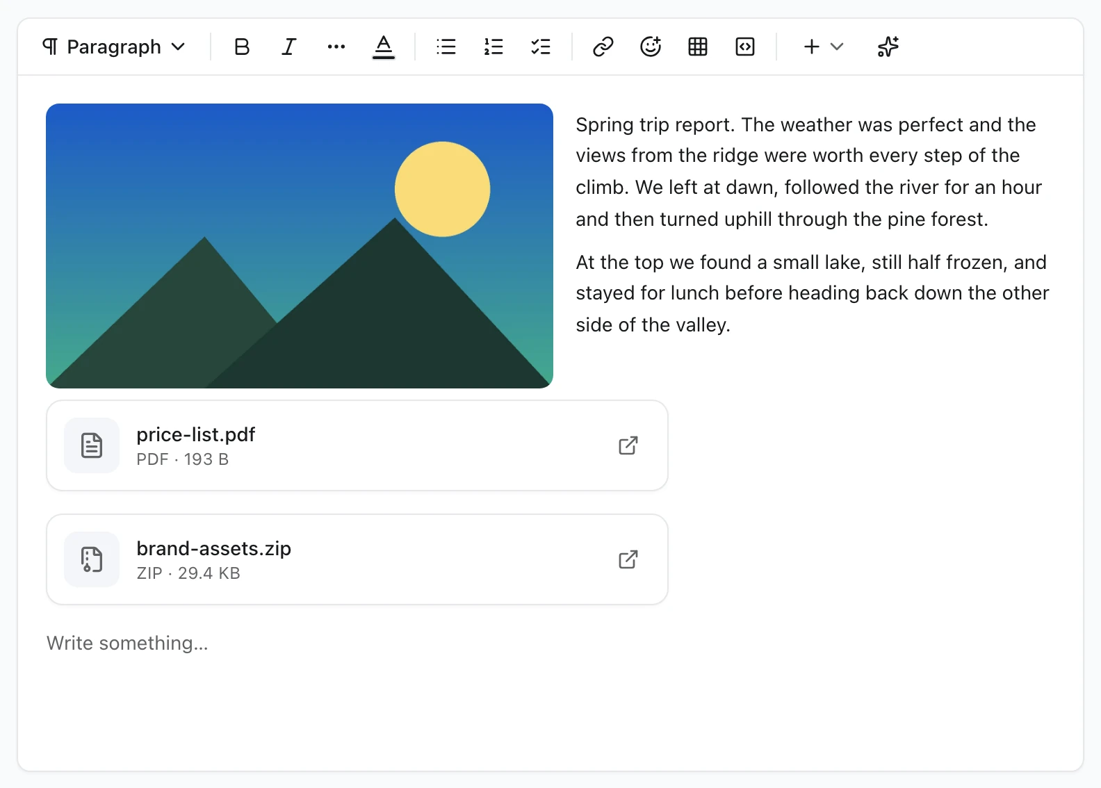
files needs session: 'admin'. The member route accepts images only, so TypeScript refuses files without it.
Content Engine fields
A Content Engine rich text field turns uploads on with one option. The AdminCP form then uploads with the AdminCP session:
body: field.richText({ required: true, uploads: true }),Edit an image
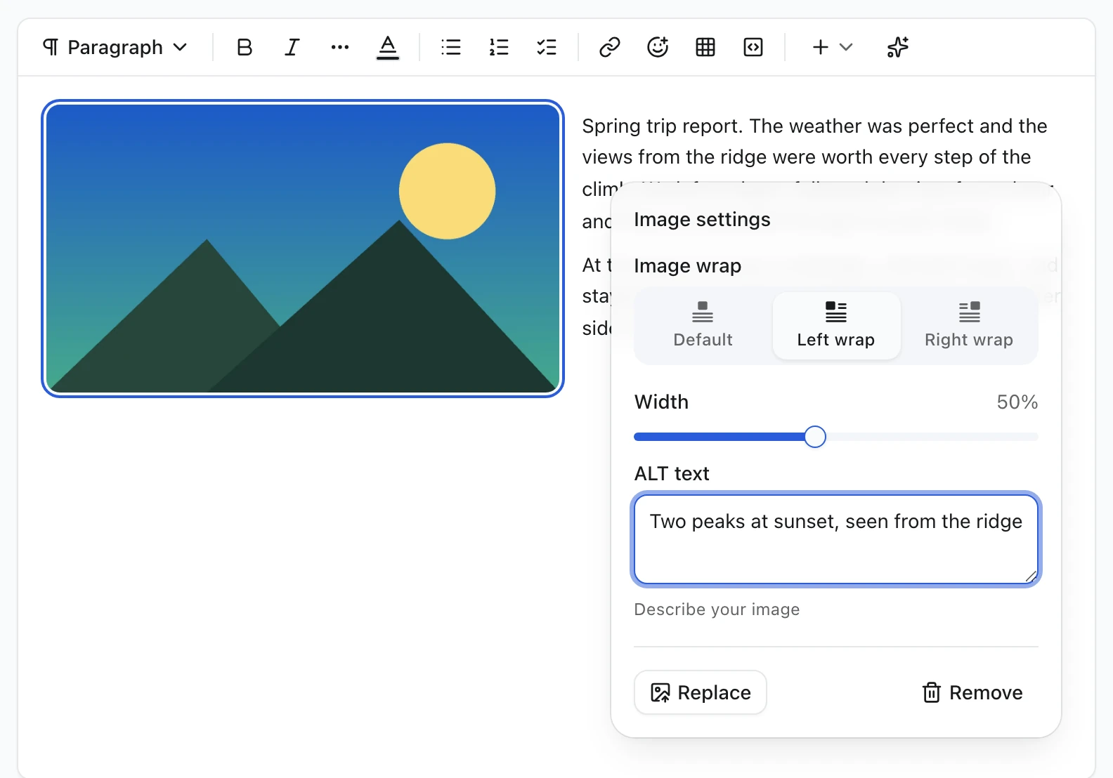
Click an image in the editor. A settings button appears in its corner:
| Setting | What it does |
|---|---|
| Image wrap | Default puts the image on its own line, aligned like the text. Left wrap and Right wrap let the text flow around it |
| Width | 10–100% of the text column. Dragging the handle on the image's edge does the same |
| ALT text | Describe your image: screen readers say this instead of the picture. Up to 500 characters |
| Replace | Uploads a new file and keeps the width, wrap and ALT text |
| Remove | Deletes the image from the document. The file stays in core_files until it is deleted there |
Choosing Left wrap or Right wrap on a full-width image shrinks it to 50% to leave room for the text. On phones, wrapped images stack above the text instead of squeezing it into a thin column.
With Default wrap, an image follows the editor's Alignment like text does. A new image takes the alignment of the paragraph it lands in, and the toolbar's left, center and right alignment work on a selected image. The alignment is saved as textAlign on the image node.
Reuse uploads in other languages
A translated article usually needs the same pictures. Nobody has to upload them twice. When another language version of the field uses images or files this one doesn't have yet, a Reuse from English bar (named after those languages) appears right under the toolbar:
- Click an image or file in the bar to insert it at the cursor, or Insert all to add every one.
- Drag it from the bar to the exact spot in the text.
- You can also drag an image or file card straight from the source column in translate mode.
Both point at the same core_files file, so nothing is uploaded again, and deleting that file later updates every language. Each item leaves the bar once this language uses it, and the bar goes away when nothing is left. It appears in AutoFormEditor with multiLang when uploads is on; a plain Editor can pass its own list through the reusableUploads prop.
When a file is deleted
Deleting an uploaded file, from Settings → Files or from AdminCP → Files, also removes it from every document that showed it. The image or attachment is replaced by a placeholder saying Image deleted or File deleted, with its old ALT text or file name crossed out. Nothing in it links to the removed file.
This happens once, right after the delete, in Content Engine rich text: records, translations, repeatable rows, revision history, live-editing drafts, and editors open at that moment. Cached public pages of the affected content types are expired. The author can remove the placeholder like any other block.
Allow images from other sites
By default every image is uploaded to your storage. To also let people insert an image by its address, set editor.images.remote in the app config:
export const vitNodeConfig = buildConfig({
  editor: {
    images: { remote: true },
  },
})
+ Insert → Image then gets a From URL tab, and pasted HTML may keep images from other sites. Only https:// addresses are accepted, so a page served over HTTPS never shows mixed-content warnings. It only applies to editors that already allow uploads.
The setting decides what the editor offers. A request sent straight to your API can still store any http(s) image in a rich text document, and renderers show it.
Upload limits
| Limit | Images | Attachments (files: true) |
|---|---|---|
| File types | PNG, JPEG, WebP, GIF, AVIF | PDF, DOC, DOCX, PPT, PPTX, ZIP |
| Size | 10 MB each | 20 MB each |
| Storage path | editor/ folder | editor/ folder |
| Owner | The uploader | The uploader |
SVG is left out on purpose, because an SVG can carry scripts. An attachment must have the extension that matches its type, and its first bytes must look like that format (%PDF, a ZIP header, or the legacy Office header), so a renamed executable is refused. With storage.image set in the API config, images are re-encoded (to WebP by default) like every other upload. Without a storage.adapter, uploads fail with a 500.
How images and files are stored
An image is an image node in the document:
{
  "type": "image",
  "attrs": {
    "src": "https://cdn.example.com/2026/10/editor/4f1c.webp",
    "alt": "Our booth at the conference",
    "fileId": 42,
    "width": 50,
    "wrap": "left",
    "textAlign": null,
    "naturalWidth": 1600,
    "naturalHeight": 900
  }
}
RichTextContent and richTextToHtml render it as <figure class="tiptap-image"> with a lazy-loaded <img>. width and height come from the stored file, so the page doesn't jump while it loads. See Rich text for rendering stored documents.
An attachment is an attachment node:
{
  "type": "attachment",
  "attrs": {
    "src": "https://cdn.example.com/2026/10/editor/9b2e.pdf",
    "name": "price-list.pdf",
    "mimeType": "application/pdf",
    "size": 397312,
    "fileId": 43
  }
}
It renders as <a class="tiptap-attachment"> opening the file in a new tab, labelled PDF · 388 KB. HTML editors store the same markup, and EditorContent keeps both through sanitizing.
After the file is deleted, the node keeps its name (or alt) and layout but has "deleted": true, "src": null and "fileId": null. RichTextContent renders the translated placeholder; richTextToHtml leaves it out.
Rendering content
Release checklist
Everything we need before v2.0 goes out to the community.
Write the changelog
Update the docs screenshots
EditorContent renders stored HTML read-only, for public pages. It sanitizes
the HTML first, so a sneaky <script> never runs.
import { EditorContent } from '@vitnode/core/components/ui/editor-content'

;<EditorContent content={post.content} />
Props
Prop
Type